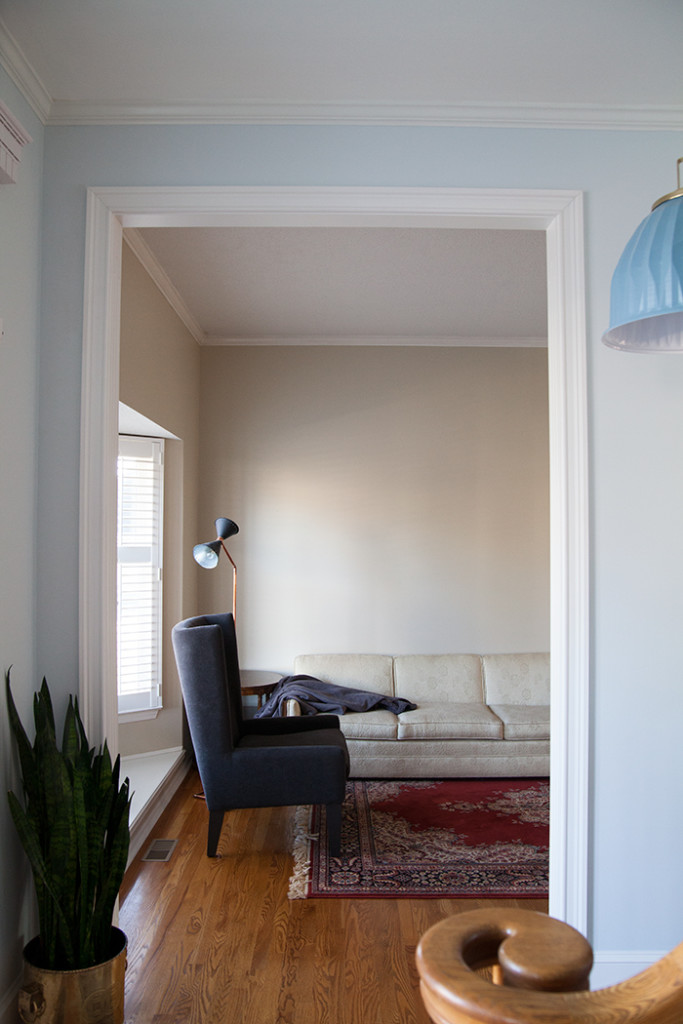
I mentioned in our first year recap that we were starting on the front room, and start we have. I’ve been concepting the space since day one, but in the last few months I’ve really solidified the bones, and it’s always exciting to see it start to come together.
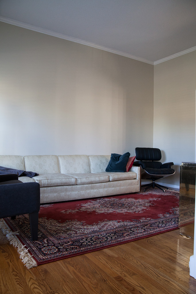
I knew the far wall needed built ins. It’s the first thing you see when you crack open the front door – a statement feels like a no-brainer. But the space is kind of odd in shape and function, so nailing down exact details has taken time. For now it’s Micah’s TV/video-gaming room. I love the look of a sofa in front of bookshelves, but the more I considered it, the less likely it seemed. The room is narrow and bookshelves weren’t going to help that. We could build around a couch, but my end goal is to house a piano in here someday. It seemed silly to even consider making the bookshelves for the short term. I made the decision to do full shelves and figure out the furniture later. Sometimes I can see a whole room from the get-go. Sometimes I have to take it step by step.
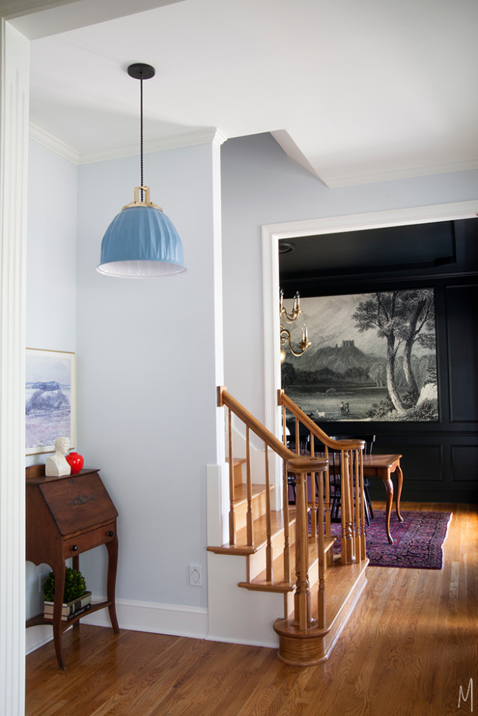
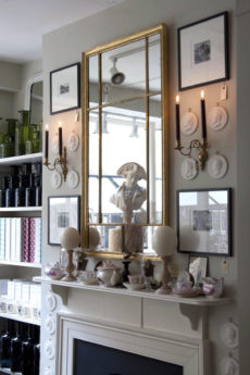
But what color would the bookshelves be? The front room is directly across from the dining room. All of that dark, inky paint needs something just as strong to bring balance. So I started considering colors. I pull inspiration from everywhere, but one of my biggest sources is British television. (Dork.) I watch a few shows a week on the iPad or computer so I can take screen shots if something really speaks to me. PBS had a good run of shows this fall, but much more than their storylines, I was into their color stories…
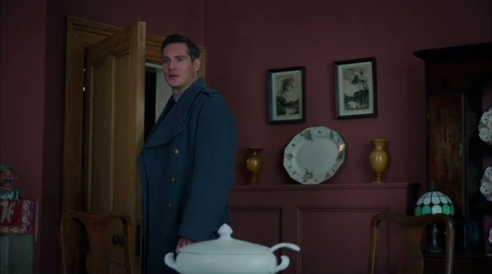

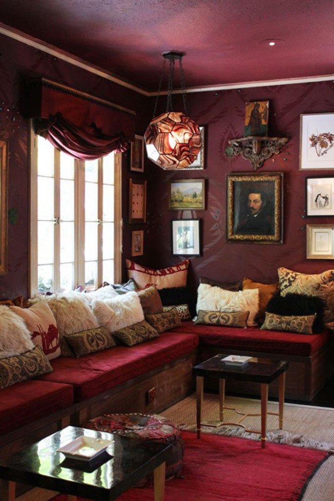
The walls in that shot of Home Fires stopped me in my tracks and the tone on tone mix from Indian Summers is so breathtaking, especially with that hit of warm wood. The colors in the womens’ coats and accessories are certainly something I could design a whole room around. Shots like this send me to my Pinterest and Houzz boards to look for similar colors and treatments. In searching for more I came across these…

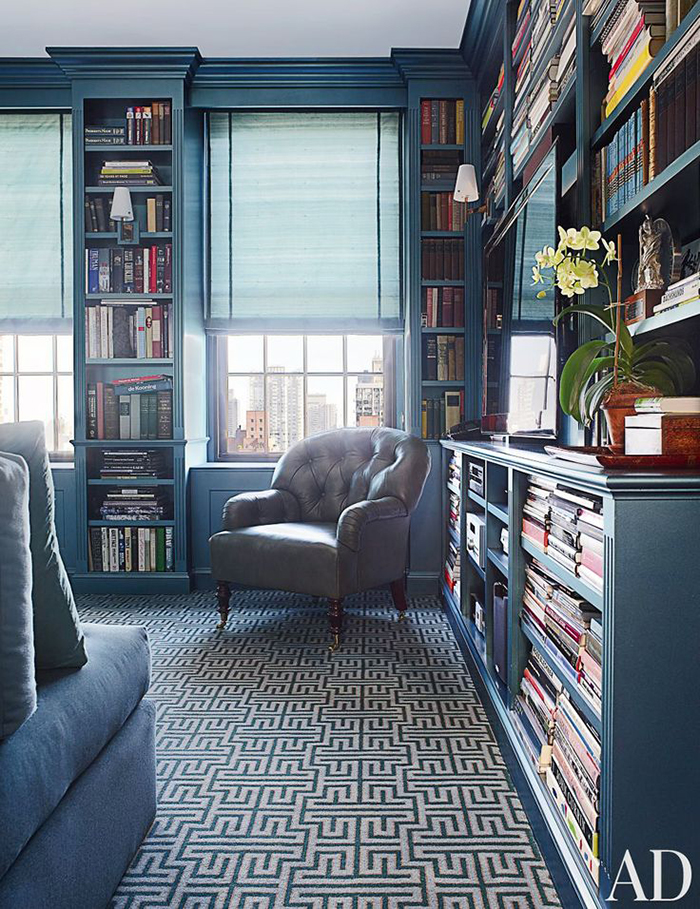
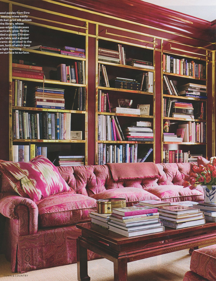
While the blue is BEAUTIFUL, it feels a little safe for me. The entry is already blue and this space can handle something more bold – it needs something more bold. Burgundy/berry it is. Micah may have threatened to cease work impending these color choices more on them later, but like every project we’ve ever done, he’s just going to have to get over it, get through it and then he’ll like it. 🙂

Can't wait to see what you decide:)
I love those colors! The green of that jacket would also be amazing. Your room is going to be beautiful.
I love seeing your design process! You have such a gift turning something small into a big design picture. Can't wait to see what you do!
I love the color palette – one room is cool, the other is warm, the hall is neutral. Its lovely! Shelves really don't need to be that deep (12") is generous which really doesn't shrink a room that much. In fact I think they are great in a narrow room because so much interest and storage is added in so little square footage. With flat screen TV's these days you can incorporate a TV in a 12" deep shelving unit. Cant wait to see what you do 🙂
I love your fearless use of color. It's such a relief from all the white out there. I think the word, though, that you were looking for when you wrote "concepting" was conceptualizing.
I think the burgundy is perfect. Its a nice balance in tone for the dark dining room and I can't wait to see what you do with it.
I literally LOLed at the last part. I swear I have the same conversations with my Hubby and he's not even doing the work! They always like the results, but feel the need to dig their heels in during the process. Stick to your guns, he'll love it ;-). Also, speaking from personal experience, adding a built-in into an already small space can have a HUGE impact! My living room is tiny and I wanted to add a built-in for years before I finally pulled the trigger. I couldn't be happier and it adds so much to the living room. I can't wait to see what you do!
What a good color choice! I also am tired of white. And gray is really getting old. These dark moody colors are the bomb! That's why I enjoy following you- you mix it up so well. The traditional with modern, classic yet bold. It's outside the box some- intentional not faddish. Keep up the good work!
Most of homes are decorated by using fine colors and texture, furniture and lights especially when it comes in curtain. Good texture and proper display of an object is one way to decorate. [www.simplicitydesignusa.com] is the best home decor and Wall coverings interior designer in aventura, bal harbour, Hallandale, sunny isles.Plase visit their website for more information about them.custom furniture design
What about the front door?