While I was in San Francisco this last April I got the chance to tour the Decorator Showcase home. I’ve been to show houses before, but this was kind of next level. The house was huge, overlooking the bay and the design was top notch. While much of the home was contemporary in aesthetic (not my personal favorite) there were some shining, modernly traditional moments and a whole lot of detail to be inspired by. Want to see some of my favorite things?
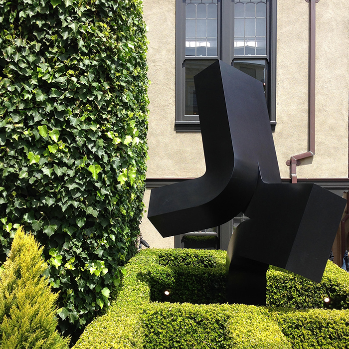
Right off the bat the house was giving the mix. This Beetlejuice-esque art (I will forever associate this style with that movie) surrounded by trimmed boxwoods and ivy caught my attention from the get-go.
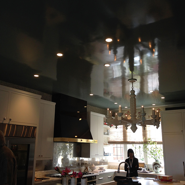
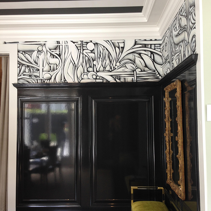
The lacquered ceiling in the kitchen was so breathtaking. Your eye was drawn right to it. I continue to see more and more lacquer (this house had it’s fair share) and it’s a luxe trend I can certainly get on board with.
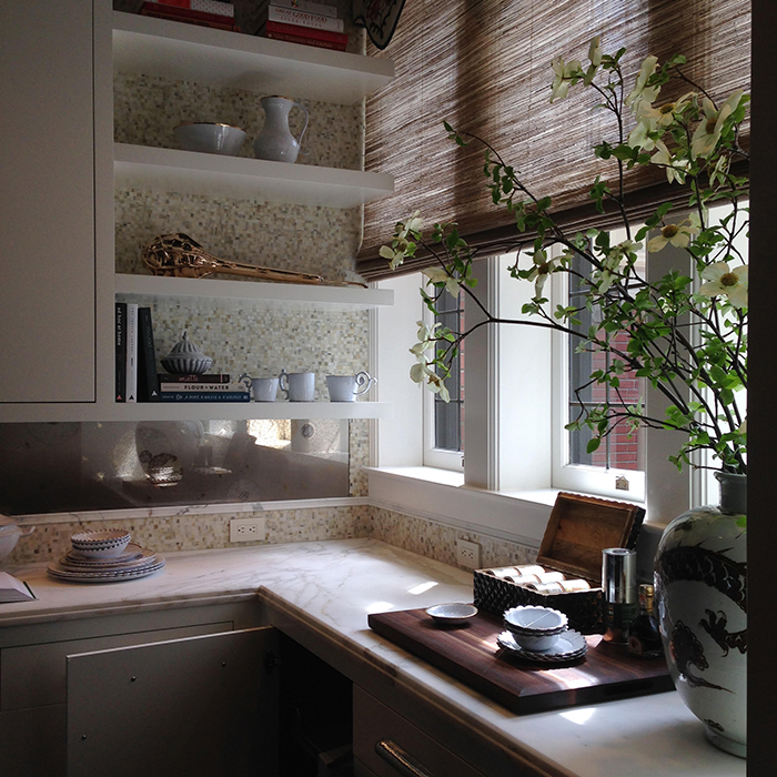
I loved this simple storage solution in the corner. The open shelving allowed for an extra window and in turn a bit more light to flood into this part of the kitchen. In every room, but especially the kitchen, I’m all for the most natural light possible.
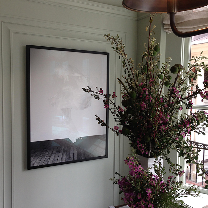
The cool mint walls, bronze light fixture and linen shades all feel a bit country casual in this breakfast nook, but the moulding and the art bring that mix. And how about those flowers?
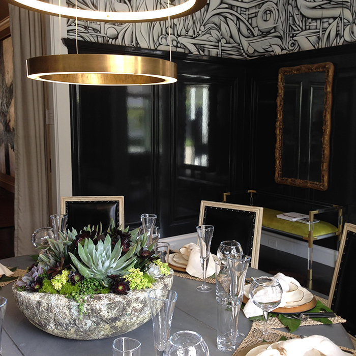
The dining room boasted more lacquer and custom painting by a street artist. It was graphic and edgy yet pretty.
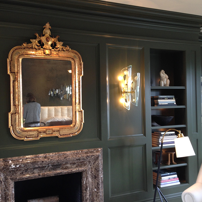
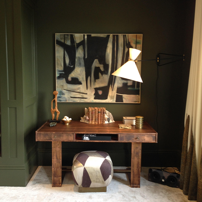
Don’t discount olive green. In the right space it can feel sophisticated and neutral. The warm wood tones feel modern and masculine against it.
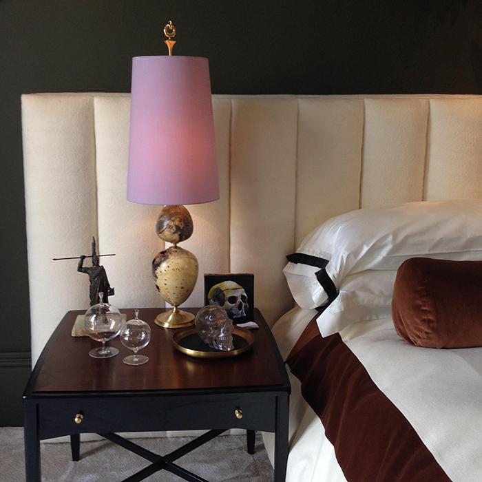
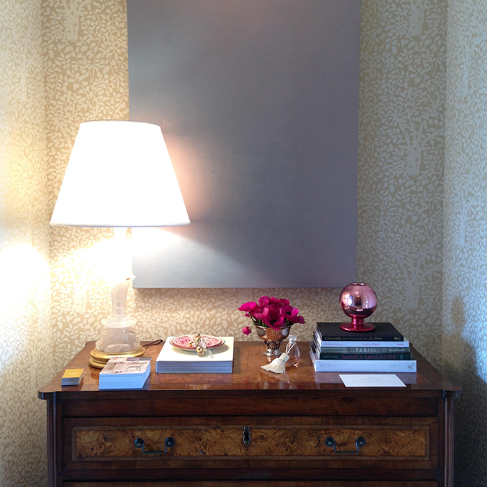
And this little pop of feminine pink is unexpected and fresh.
As far as real life, this dressing room’s palette was one of my favorites not that a dressing room is real life for most.
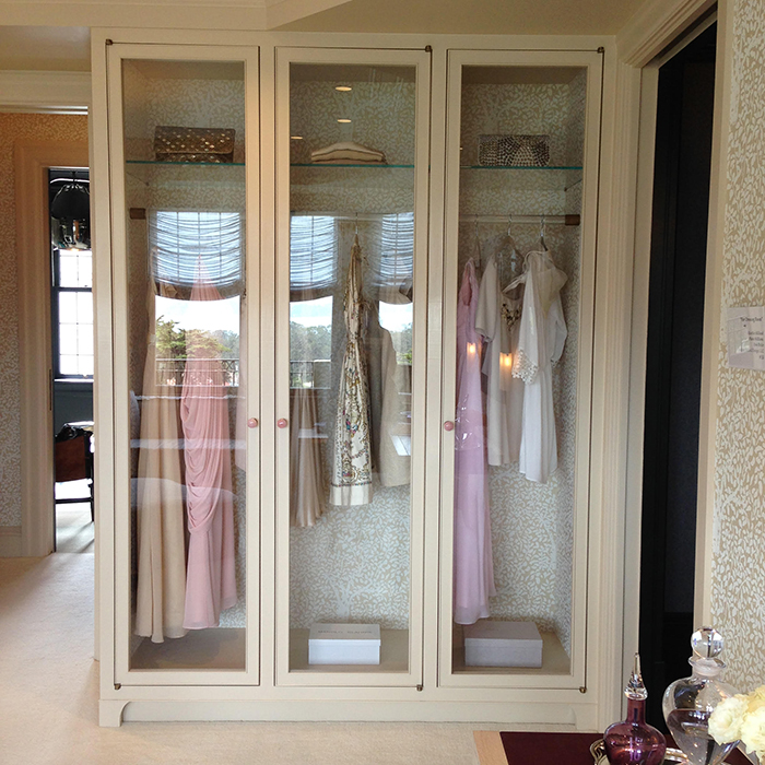
The best way to make cabinets appear to take up less space is to line the insides in the same paper/paint as the walls of the room.
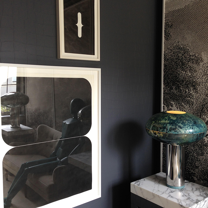
Not all art has to say something. This solid colored canvas allows you to take in the details of the woodgrain and the delicate wallpaper. What a simple DIY. Speaking of wallpaper, it’s back.
Maybe not back to the extent that it was in the 80s and 90s moulding and millwork’s resurgence is taking up it’s fair share of wall space, but it’s definitely back. And it’s available in so many different incredible colors, textures and finishes.
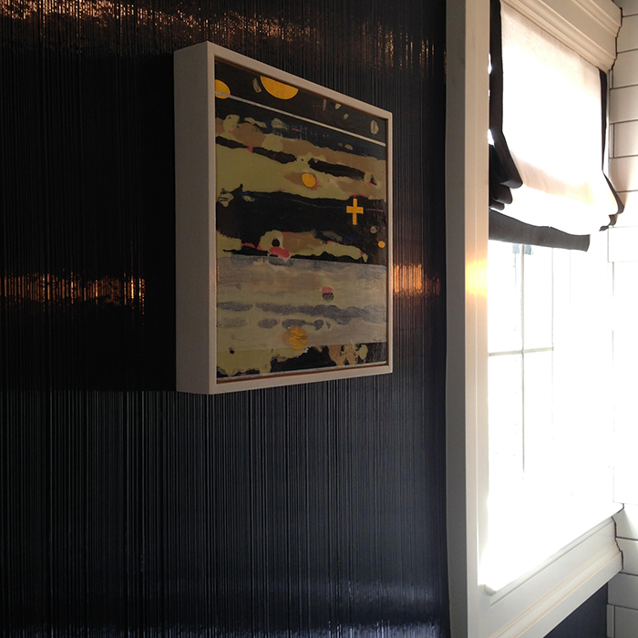
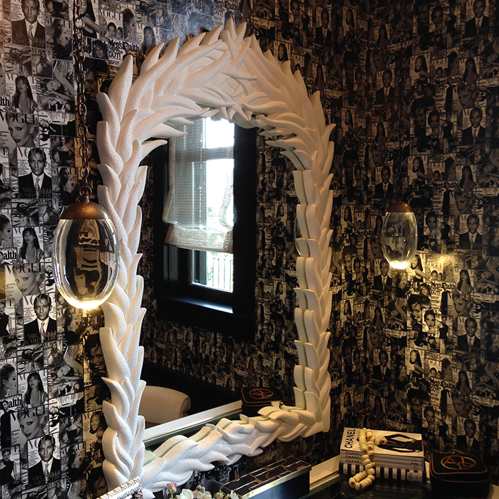
I first thought this lacquered texture was a paint treatment, but in fact it’s a wallpaper.
And it skews from dark navy to cobalt depending on the light. Chameleon colors are my favorite.
If you have room in your bath to add a piece of real furniture, always take advantage. Maybe there’s not space for a chaise, but something as simple and small as a garden stool can create seating and depth.
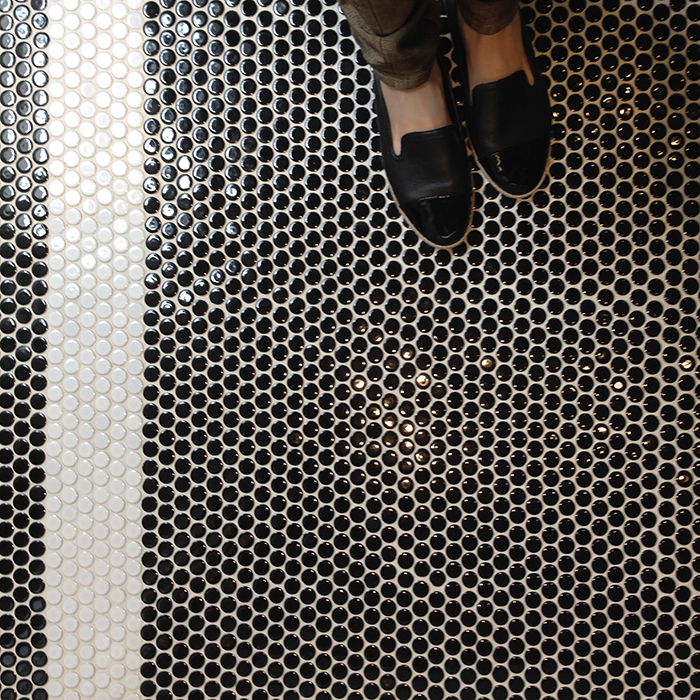
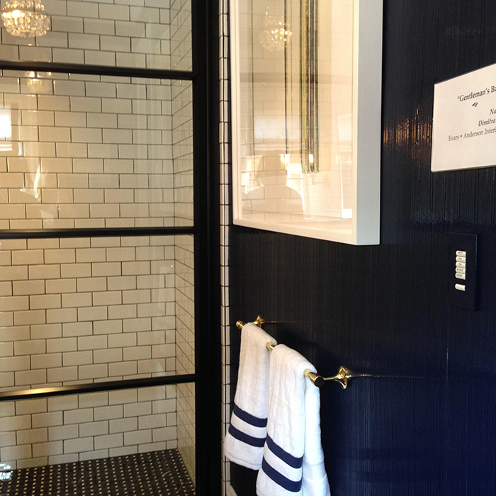
Even when you choose a classic floor, like a penny tile, there is always a chance to add a bit of detail. This white stripe around the perimeter of the room looks more expensive than just using the same color throughout, but it doesn’t cost any more money.
Wallpaper, lacquer, decorative trim and mouldings…are you implementing these things into your home?


This looks amazing – would love to see in person! The kitchen is so beautiful, and the bathroom…stunning!
Wow how gorgeous and dramatic everything is. I can't even say what my favorite part is.
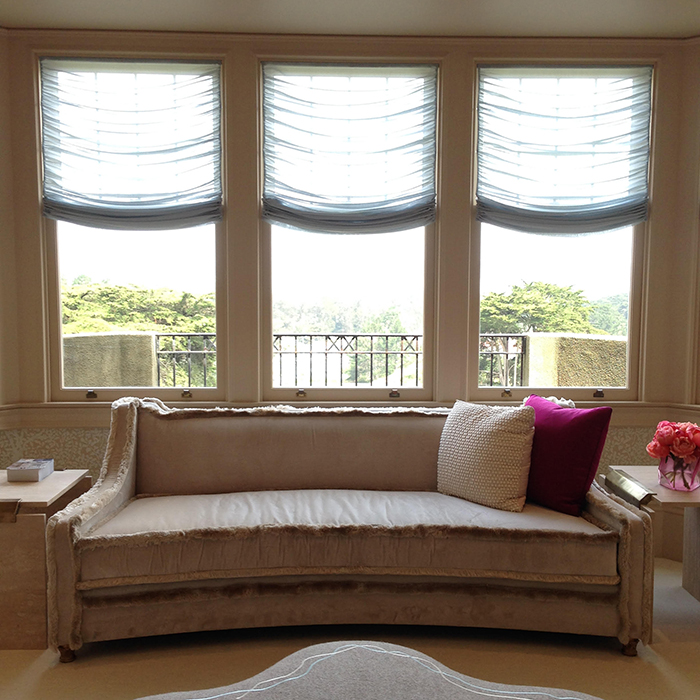
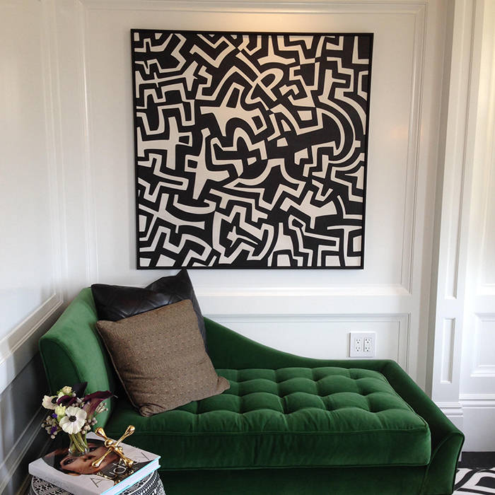
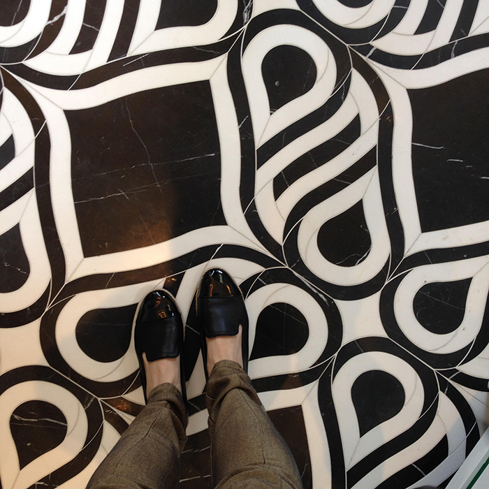
How fun to see all that in person. I am loving the tile and that sofa intrigues me 🙂 xo
We'll done.
fantastic ideas! I love those open shelves in the kitchen in the corner…what a fantastic solution. i keep studying all these photos…so good!
That’s great post! I feel very happy one reading this post.
Concept Home Decor Stores