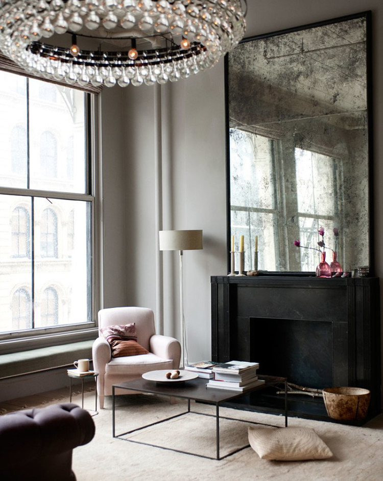
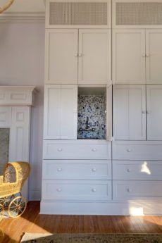
 Home of Harriet Maxwell McDonald via Elle Decor
This month has been such a blur for great and tragic reasons. September is filled with birthdays, Xander’s was last week and mine was Sunday anniversaries, ours was yesterday and lots of activity and excitement with the school year really kicking into gear. While so much has been good, last week my dear friend’s 11-month old daughter had heart surgery and didn’t make it through the surgery. Jane spent much of her life in the hospital, but she was such a joyous and thriving little girl. You would have never guessed she had special needs on the inside.
I had planned to blog last week, but supporting my friend and savoring my kids was all I could focus on. I know that God gives us each different gifts, but when faced with heartbreaking events, I’m left feeling so incredibly silly agonizing over paint colors and stone selections. If you feel led, I know Catherine, Derek, and their other daughter, Mary Grace, could really use your prayers.
 Despite my desire to simply hold my babies for the rest of eternity, life does go on. And the plans for the wood room what will I call it when it’s painted?? are taking shape. I was so blown away by your feedback for my plan to paint and really glad so many of you agreed. Paint is going to make such a big difference. So let’s talk about the color shall we? Most of you assumed I’d be going lighter and you’re right. While white feels a bit too predictable and clean, I still want something that feels light and neutral.
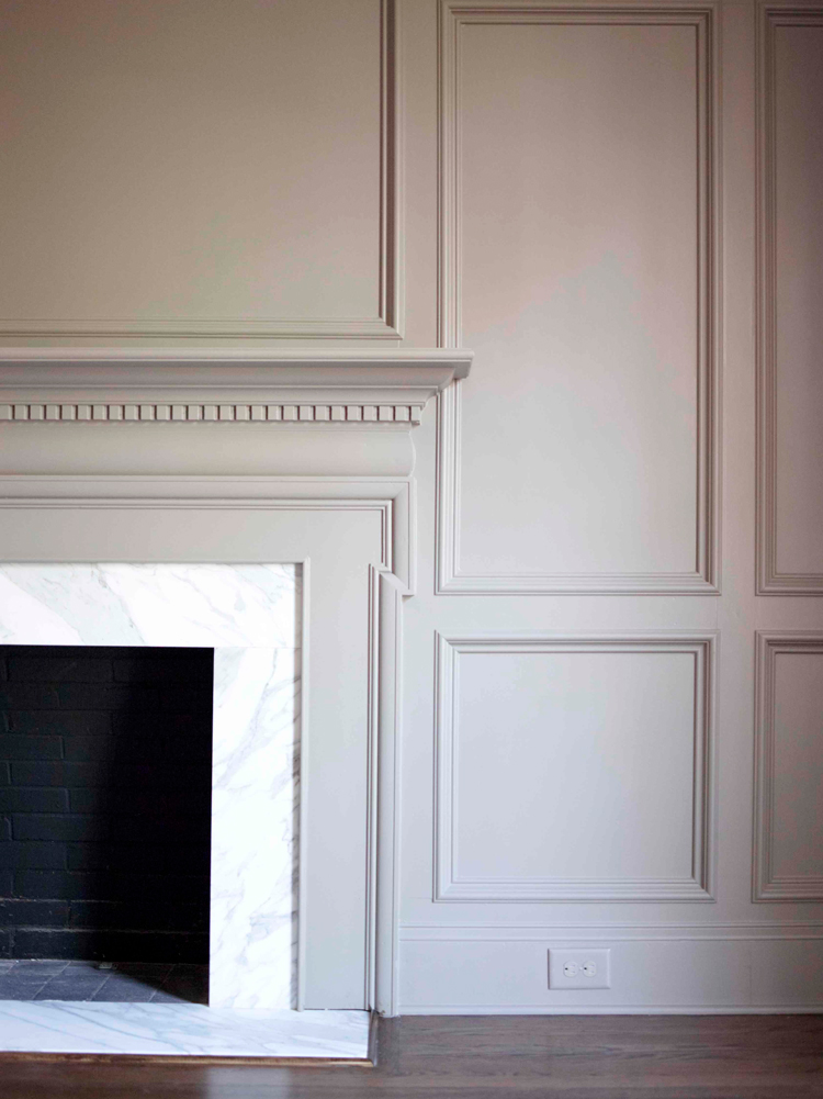
A muddy taupe is where I’ve landed, and I think the tone will not only work well with what’s going on in the space now, it will also act as a great connector for all of the adjoining rooms. I’m looking at Farrow and Ball’s Elephants Breath and Sherwin Williams Realist Beige or Pediment. After nailing the wall color I decided there was one area that could really use a refresh just as much as the orange-y oak and that was the fireplace surround. The tile was ok, but not doing the space any favors. Plus, if the walls were going lighter I liked the idea of some contrast with the surround.
Many of you assumed I’d be keeping the fireplace painted black, but it will be going taupe as well. I think you’ll understand why as things come together. I’ll save those details for another post, but I am really excited to say that this afternoon a team from Top Master will be out to install our new Dekton slabs. This product is amazing, and once we get to painting I don’t think you’ll even recognize this room!
I had a great shoot with Hallmark on Monday for some holiday videos I can’t wait to share in the coming months, but I’m excited to share the Halloween episode with you right now!
It’s hard to believe it, but Halloween is right around the corner! Halloween is a holiday that you want to decorate for both kids and adults, and I’m showing you how in this new video with Hallmark Gold Crown. Along with decor tips to satisfy all of your guests, I’m showing you how to create an adorable, batty place card that is a memorable addition to any table.
What do you think about the color? I can’t believe I’m considering a shade with “beige” in the name! Never say never, right?
The wood room becomes white, see here.
*I’m partnering with Hallmark Gold Crown but all thoughts and opinions in this post are my own.
First, I want to express my condolences to you and your friend and her family over the loss of their daughter. How absolutely heart breaking. I hope they are finding some comfort in being surrounded by friends and family who care about them and their loss. Wish I had better words, but I will say a prayer for them.
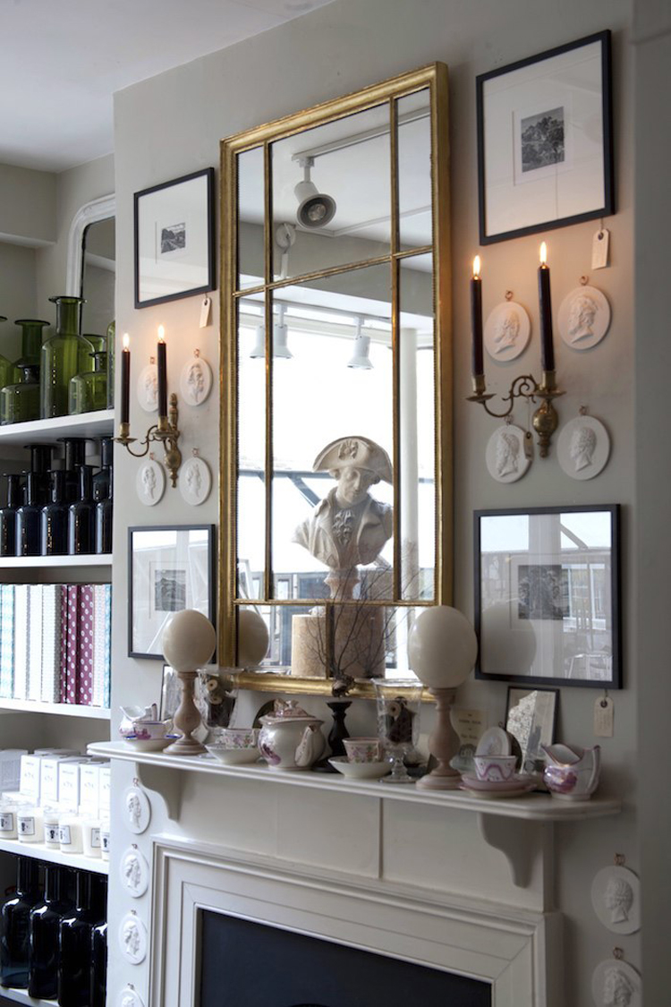
Second, those colors sound like they would be great for the living room! (Is Elephant’s Breath your man cave color too?) I love that color and think it probably needs big open spaces. Just thinking about the ideas, they seem like they’ll go perfectly with the other colors in your downstairs. You really seem to nail it with color…coordinating without matching the different rooms. I bet they will look great with the color in the dining room, too. By the way, I have pinned that image at the top, I love that room! I just picked up a big mirror at a yard sale for $5 and I am going to antique it to go over my fireplace based on this picture. If that is the same room I pinned, I thought the color was or like Revere Pewter, which I have in my living room and dining room. I also painted my fireplace the same color as the walls and I love it. It gives the room a polished classic look, I think, when trim color is the same as the walls. Can’t wait to see what you do with the room…I know I will be in love with it!!
Thank you Tanya! It is Elephant’s Breath, but looks so different up here compared to the windowless basement. Can’t wait to show you!
I don’t think I have ever audibly gasped when reading my computer screen until I did when I read your dear friend’s sweet baby girl didn’t make it through surgery. ? Tragic. I am so sorry for her mama and daddy.
Thank you, Pamela, yes, it’s been so tragic but her faith has been inspiring!
I also wanted to say I’m sorry…that is terrible news. I struggled with my father’s terminal illness and his increasing disability over the last two years of his life (he died a year and a half ago), and you’re right. You absolutely have to do the normal stuff. It feels wrong sometimes, but living is often just the blase everyday, as well as the profound and the tragic, so it makes sense to accept that the blase stuff also has to continue.
Anyway, I have a paint rec. I wanted to use Farrow & Ball’s Pavilion Gray in my dining room. I got the sample pot and it was perfect, but I absolutely could not afford it. I used encycolorpedia to get some close options, and I landed with Colonnade Gray by Sherwin-Williams. In Cashmere’s flat on the walls and wood paneling, and low lustre on the door frames and baseboards, it’s a very decent similarity. I’ve had it now for 4 years, and I love it. Every day, I love it. It’s warm, but not too warm, and it does NOT have the purple-y undertone the light grays/taupes often have. It’s more of a green/yellow undertone, which is much better for a 117 year old with modern furnishings. This weekend, I’m sucking it up and finally painting my entryway and hallways to match. I hate painting, and I’ve been putting it off, but it is so beautiful I just have to.
Sounds beautiful! So glad you love it. I’m sorry to hear about your dad. That struggle is so hard, but I pray you’ve found peace!